Articles by hdavis

You are currently browsing hdavis’s articles.

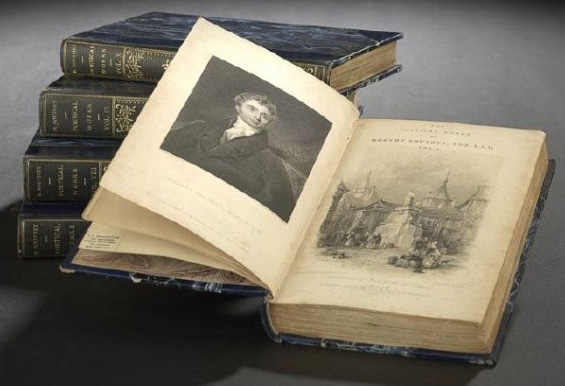
Robert Southey (English, 1774 to 1843), Poetical Works, London: Longman, Orme, Brown, Green and Longmans, 1837-1838, compete in ten volumes, duodecimo, in blue half-leather with marbled boards and endpapersYou may not be able to judge a book by its cover, but you can at least tell its size, but to do that, you have to know a little bit about the printing process, which basically, at least when it comes to paper sizes, has two eras: the modern era and the hand press era. In the hand press era (pre-1820, for the most part), printing was done on large sheets, on both sides, and then the sheets were folded and stitched along the folds. (The spatial reasoning necessary to lay out a sheet’s worth of printing, knowing which way the text would appear and the pages would be ordered when folded, is impressive.) Each set of pages created from the same folded sheet was called a gathering and multiple gatherings would all be bound together to create the finished book. Sometimes the edges of the gathering were trimmed on the three exposed sides, but in early books, you might have to use a knife to slice through the folds of the gathering to separate each page yourself.

In this system of printing, page sizes were determined by how many times the original sheet was folded. A folio (2° or fo) would been folded once, down the center, and with two pages of text printed on either side, it would create four printed pages. This is designated as the “format” of the book. Quartos (4° or 4to) would be folded twice to produce four leaves/eight pages, octavos (8° or 8vo), three times for eight leaves/16 pages, etc., with the sizes continuing through duodecimo (twelvemo – 12° or 12vo), sextodecimo (sixteenmo – 16° or 16vo), octodecimo (eighteenmo – 18° or 18vo), trigesimo-secundo (thirty-twomo – 32° or 32vo), quadragesimo-octavo (forty-eightmo – 48° or 48vo) and sexagesimo-quarto (sixty-fourmo – 64° or 64vo).

One challenge with deciphering this is that in the hand press age in particular paper sizes were not typically standardized or, if they were, it was only within a particular region or country of manufacture. As a result, sizes of quartos, for example, can vary because while all quartos have gatherings that are folded twice, the size of the original sheet can vary. This means that quartos printed in Italy and quartos printed in England in the same time period can be different sizes.

In modern production, sizes are standardized and most books are quartos or octavos. There are designations for less typical sizes as well, which are heard more commonly in reference to prints than books: elephant folio, atlas folio and double elephant folio. As with all paper objects, condition is paramount, with size playing the largest role when it comes to prints but little role at all with books. In fact, most sellers do not give physical dimensions for books, as historically, much like today, books were not printed in multiple sizes at the same time and the other information: place of publication, year, etc., is more useful to collectors. Determining the rarity of books typically has more to do with when and where they were printed and what edition a volume is than the size, although of course, this does not necessarily apply when the books are out of the traditional size range. And books do not change sizes as prints can, so more on the specifics of paper sizes related to prints in our next post….

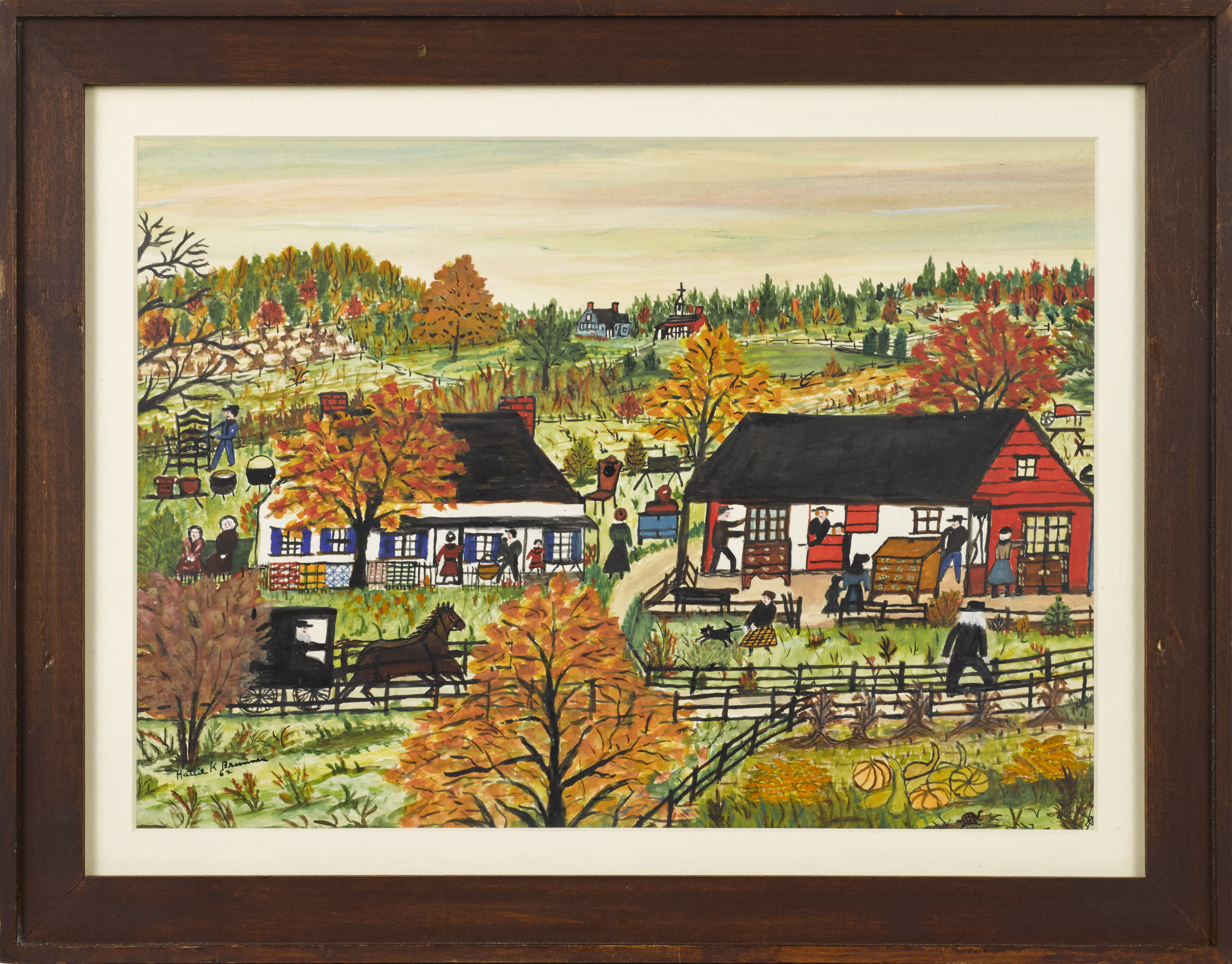
Hattie Klapp Brunner (American, 1889-1982) watercolor and gouache on paper painting, fall Amish auction scene, signed and dated '62 in lower left.

Gouache {sometimes referred to as body color and pronounced “gwash”) and watercolor paintings are often not clearly distinguished as being different, perhaps because making the distinction just based on a visual examination can be difficult, perhaps because both techniques are often used in the same work, but they are different in fundamental ways. They share the same binding agent but there is far more pigment in relation to water in gouache. Gouache, unlike watercolor paint, is opaque and sometimes to heighten the effect of this opacity, chalk or some other white pigment may be added. All the additional pigment and decreased water makes gouache much heavier – and they mean that gouache covers more quickly, dries more rapidly, and that it has to be used in more direct, less subtle ways than watercolor, as it does not offer the bleeding, shading, and layering abilities watercolor does.

Because of the solid, “flat” appearance of gouache when dried, it is very popular in designs like posters for commercial illustrations. Gouache is also used frequently in connection with watercolor, perhaps most notably in hand-drawn animation where gouache provides the solid, dramatic color needed for characters and watercolor allows for subtler, softer background elements.

While it is by no means a common medium, gouache offers certain advantages (en plein air artists tend to favor it because of the rapid drying) and it also was frequently used for studies for larger works. Matisse, Magritte and Klee are among the well-known artists who have worked in gouache, but it dates back centuries with forms of it documented in ancient Greece, in ancient Egypt and in the illuminated manuscripts of Europe. It has a role in a wide variety of painting styles and historical traditions.

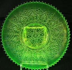
 A Northwood, Carnival glass vaseline Heart & Flowers plateAs I’ve discussed here before, terms commonly get conflated and misused, only to end up with a much wider application than is accurate. “Vaseline glass” is yet another example of this. More properly termed uranium glass, this glass has had uranium added to the mixture that is then melted down, colored and formed into glassware. Most pieces have only trace amounts, definitely less than 2% by weight, of uranium, although some pieces were nearly 25% uranium by weight. Uranium glass normally appears on the yellow-green spectrum, depending on the influences of the uranium and other colorants used, but regardless of the color in natural light, it fluoresces in a vibrant green shade when placed under ultraviolet (“black”) light.

The “Vaseline” part was originally applied to a particular pale yellowish-green transparent/semi-transparent shade of uranium glass as it was thought to look like the 1920s version of Vaseline and other petroleum jelly, but over time, it’s come to be used, particularly in the US, for uranium glass in general and sometimes, particularly sloppily, even for any glass in that same yellow-green color range, regardless of whether or not it fluoresces. Properly, it is simply a subtype of uranium glass, as are custard (pale yellow), jadite (pale green) and Depression glass (which is also pale green but transparent/semitransparent vs opaque/semi-opaque). (Depression glass is, clearly, another one of those terms, as it often is applied to any glassware, particularly any colored glassware, produced during the years of the Depression.)

There’s nothing new about uranium glass, as archaeology dates it back to 79 AD and it was also used in European glass production for centuries, but it really began to boom in the 1800s, reaching its peak during the late 19th century and early 20th. Uranium glass production, table- and housewares, had slowed considerably by the start of World War II, but when the use and availability of uranium was heavily restricted and controlled during the end of the war and throughout the Cold War, the manufacturing of uranium glass took a dip that it never really recovered from, although there are still those today who work with uranium glass.

As with all glass, color, condition, maker, pattern, and form all play a role in the value uranium or vaseline glass brings at auction.

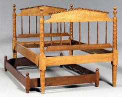
A Tennessee Sheraton tiger maple bedstead, highly figured maple with poplar secondary, head and footboards with pitched pediments and finely turned posts; together with a walnut and cherry trundle bedWhen many people see trundle beds, they think of Little House in the Big Woods. They may also think of impoverished people, frontier living, too many people and not enough room. In reality, trundle beds have been around far longer and have a very different tradition in history.

But first, to define them: trundle beds (also sometimes called truckle beds) derive their name from little wheels or casters that allowed them to be “trundled” out of the way. (The word has its roots in an Old English word, trendan, which means to revolve.) They’re simply smaller, lower beds that can be pushed or “trundled” under the larger, main bed, leaving space free during the day or during longer periods when an additional bed isn’t required.

While as mentioned some of the strongest associations tend to be with the 19th century and frontier life, a transition they may have gradually made during their use in America, but in Europe, trundle beds were actually in use as early as the 1600s and were actually in use in more prosperous homes, where they were occupied by servants. For example, Samuel Pepys, he of the exhaustive diaries, occasionally mentions that their servant slept in their room on a trundle bed. The European tradition of a trundle bed is rooted in the homes of those wealthy enough to have personal servants – maids and valets – who slept at hand during the night, in case the fire needed fed, the chamber pot needed emptied, etc. Trundle beds were tucked away and easily hidden in the heavy drapes and bed curtains on the beds of the prosperous.

They were occasionally used that way in wealthy homes in America too, and it isn’t hard to imagine an invalid or a woman late in pregnancy desiring to have a servant close at hand during the night, but they also quickly found use in smaller homes. There they were typically rope beds with corn or straw mattresses and for a time, they enjoyed a warm sort of nostalgia, a sense of home and a close and loving family, but as families began to prosper and the middle class emerged, houses grew larger, trundle beds were required less frequently, and a stigma even began to attach to them in some ways.

As for their value at auction, well, beds of any sort can be a hard sell. You have to be particularly committed to making accommodations for old rails – replacement rails and a platform, mattress overhanging the sides of the frame, etc., and that’s only truer for beds that are so low to the ground. However, when they are paired with another bed of strong value, when they are part of a prestigious collection, and/or when they have old paint with a good, pleasing color, then they can still bring several hundred dollars at auction.

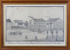
A pencil on paper drawing by Ferdinand A. Brader (American, born 1833), Residence of Peter and Louise Lamielle, Harrisburg, Stark County, Ohio, 1886.With the kids flitting around, I’ve been casting about for something creative and have found some satisfaction with photography. It’s convenient, it’s cheap, and unlike knitting a pattern, I can stop at just about any point if (when…) there’s a household crisis. One of the things that confounds me as a photographer (mostly, I realize, due to the limitations of the equipment I work with) and one of the same reasons we appreciate the photographers we do is the ability to capture what we see. How often have you looked at your beach sunrise pictures and thought, “It just doesn’t do it justice”?

Accurately rendering a panoramic view has, apparently, long challenged, obsessed and inspired artists. The trend seems to have sprung up in the 17th century, with works that served both as slightly more helpful, more detailed maps with various public or important buildings marked, but also as advertisements for towns and cities. Matthaeus Merian, a Swiss engraver who spent most of his career in Frankfurt, where he also ran a publishing house passed to him by his father-in-law, found raging success with the publication of a 21-volume work, Topographia Germaniae, which leaned heavily on his uniquely drawn map views, a work so popular it was reprinted numerous times.

Throughout the late 18th and early 19th century, these works continued, often done in America by travelers, so they began to lose their “Chamber of Commerce” feel in some cases. By the latter half of the 19th century, commissioned paintings of panoramic views versus the earlier print versions were finding favor among the wealthy benefactors of communities, often conveying a sense of “Look what I have built” or “I am ruler of all I survey.” Artists like Ferdinand Brader (pictured above) found success with similar views done as drawings, lower-cost versions for the successful middle class.

Shortly after the dawn of photography, photographers began to experiment with panoramic views as well, with some very early glass stereoview images from high points in European cities like Paris. Throughout the last half of the 19th century and into the first half of the 20th, photographers continued to experiment with various techniques for producing panoramas, initially by seaming individual photographs together and later by working with cameras set on a clockwork mechanism that allowed a photograph, pan, photograph, pan progression (which made it possible for the occasional trickster to dart from one end of a group photograph behind the group to the other end, thus appearing in the same photograph twice).

Clearly, the idea of panoramas continue to fascinate us and the technology continues to evolve, as an iPhone app that allows panoramic photographs was a significant enough feature to warrant space as a selling feature in ad campaigns. Clearly we all just keep trying to do justice to the world we see around us!

« Older entries § Newer entries »