Works on Paper

You are currently browsing the archive for the Works on Paper category.

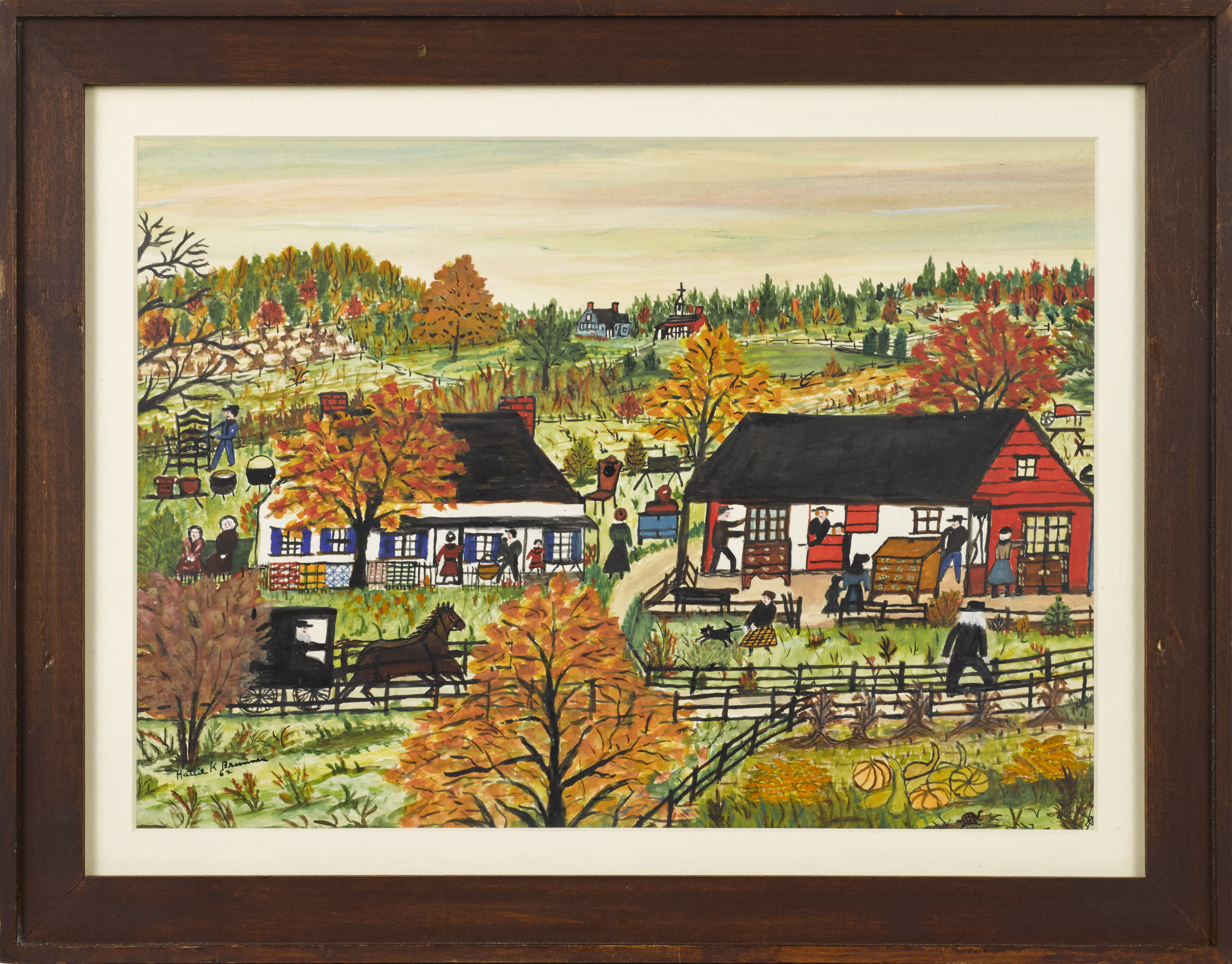
Hattie Klapp Brunner (American, 1889-1982) watercolor and gouache on paper painting, fall Amish auction scene, signed and dated '62 in lower left.

Gouache {sometimes referred to as body color and pronounced “gwash”) and watercolor paintings are often not clearly distinguished as being different, perhaps because making the distinction just based on a visual examination can be difficult, perhaps because both techniques are often used in the same work, but they are different in fundamental ways. They share the same binding agent but there is far more pigment in relation to water in gouache. Gouache, unlike watercolor paint, is opaque and sometimes to heighten the effect of this opacity, chalk or some other white pigment may be added. All the additional pigment and decreased water makes gouache much heavier – and they mean that gouache covers more quickly, dries more rapidly, and that it has to be used in more direct, less subtle ways than watercolor, as it does not offer the bleeding, shading, and layering abilities watercolor does.

Because of the solid, “flat” appearance of gouache when dried, it is very popular in designs like posters for commercial illustrations. Gouache is also used frequently in connection with watercolor, perhaps most notably in hand-drawn animation where gouache provides the solid, dramatic color needed for characters and watercolor allows for subtler, softer background elements.

While it is by no means a common medium, gouache offers certain advantages (en plein air artists tend to favor it because of the rapid drying) and it also was frequently used for studies for larger works. Matisse, Magritte and Klee are among the well-known artists who have worked in gouache, but it dates back centuries with forms of it documented in ancient Greece, in ancient Egypt and in the illuminated manuscripts of Europe. It has a role in a wide variety of painting styles and historical traditions.

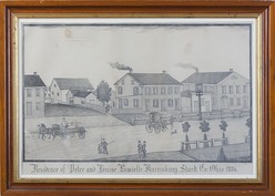
A pencil on paper drawing by Ferdinand A. Brader (American, born 1833), Residence of Peter and Louise Lamielle, Harrisburg, Stark County, Ohio, 1886.With the kids flitting around, I’ve been casting about for something creative and have found some satisfaction with photography. It’s convenient, it’s cheap, and unlike knitting a pattern, I can stop at just about any point if (when…) there’s a household crisis. One of the things that confounds me as a photographer (mostly, I realize, due to the limitations of the equipment I work with) and one of the same reasons we appreciate the photographers we do is the ability to capture what we see. How often have you looked at your beach sunrise pictures and thought, “It just doesn’t do it justice”?

Accurately rendering a panoramic view has, apparently, long challenged, obsessed and inspired artists. The trend seems to have sprung up in the 17th century, with works that served both as slightly more helpful, more detailed maps with various public or important buildings marked, but also as advertisements for towns and cities. Matthaeus Merian, a Swiss engraver who spent most of his career in Frankfurt, where he also ran a publishing house passed to him by his father-in-law, found raging success with the publication of a 21-volume work, Topographia Germaniae, which leaned heavily on his uniquely drawn map views, a work so popular it was reprinted numerous times.

Throughout the late 18th and early 19th century, these works continued, often done in America by travelers, so they began to lose their “Chamber of Commerce” feel in some cases. By the latter half of the 19th century, commissioned paintings of panoramic views versus the earlier print versions were finding favor among the wealthy benefactors of communities, often conveying a sense of “Look what I have built” or “I am ruler of all I survey.” Artists like Ferdinand Brader (pictured above) found success with similar views done as drawings, lower-cost versions for the successful middle class.

Shortly after the dawn of photography, photographers began to experiment with panoramic views as well, with some very early glass stereoview images from high points in European cities like Paris. Throughout the last half of the 19th century and into the first half of the 20th, photographers continued to experiment with various techniques for producing panoramas, initially by seaming individual photographs together and later by working with cameras set on a clockwork mechanism that allowed a photograph, pan, photograph, pan progression (which made it possible for the occasional trickster to dart from one end of a group photograph behind the group to the other end, thus appearing in the same photograph twice).

Clearly, the idea of panoramas continue to fascinate us and the technology continues to evolve, as an iPhone app that allows panoramic photographs was a significant enough feature to warrant space as a selling feature in ad campaigns. Clearly we all just keep trying to do justice to the world we see around us!

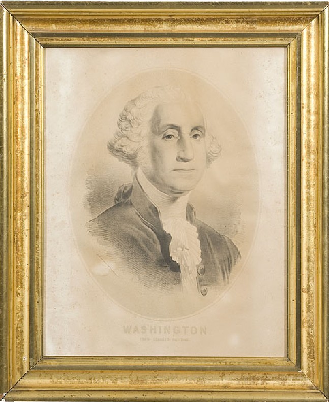
Lithograph of George Washington

Lithograph of George Washington based on a Gilbert Stuart portrait.

The word lithography comes from Greek lithos, meaning “stone” and grapho, meaning “writing.” Although “stone writing” is sometimes done today with a metal plate, traditionally the process gets its name from the use of limestone.

Lithography is made possible by one of the simplest scientific phenomena – the repelling relationship between water and oil. A hydrophobic (water-repelling) substance with a fat or oil base is used by the artist to draw the image directly on the plate, and then the plate is washed with a hydrophilic (water-drawing) solution. The plate is kept wet during printing, and the water moves to the hydrophilic blanks, repelling the oil-based printing inks toward the hydrophobic design. While a variety of options exist for hydrophobic materials, the key to success is a substance with oils that stand up to the presence of water and acid. A weak hydrophobic substance contributes to a lack of crispness in the plate image and thus in the resulting printed images.

This process was invented by Aloys Senefelder, a Bavarian writer, in the 1790s, and Senefelder predicted, but did not truly pioneer, the successful use of color that would blossom in the early 19th century. Introducing color to the process was the work of Godefroy Engelmann in the 1830s. Color lithography, known as chromolithography, requires the artist to break the image down into colors, creating a separate plate for each color to be applied. The challenge with chromolithography, and one of the key measures of quality, is how carefully the plates are aligned for each application. This is referred to as “registration” or being “in register,” revealing the care and attention to detail supplied by the printer.

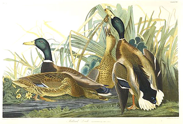
While originally intended mostly for the creation of images, lithography soon became a popular method for printing texts, especially those in Arabic and other scripts where the characters are linked in a way that makes movable type less than ideal. The richness of chromolithography was not lost on artists, however, and found popularity throughout the 19th century, especially among French artists like Edgar Degas and Toulouse-Lautrec and in nature prints like those inspired by John James Audubon.

Bien chromolithograph of mallard ducks after John James Audubon.While stone is no longer the basis for the process, making “lithography” somewhat of a misnomer, lithographic printing is still widely used today. In fact, it is the method by which most modern mass printing is done. Today, the process involves a photographic process and flexible plates of aluminum, polyester or even paper. A photographic negative of the desired image is created and applied to a plate coated in a light-sensitive emulsion. Exposure to ultraviolet light creates a reverse of the negative reverse – a positive of the original image – on the plate. This transfer of images is also sometimes accomplished with the use of laser technology, but in the end the process remains the same: water is applied and rejected by the emulsion, hydrophobic ink moves toward the areas of design, and the basic conflict between oil and water continues to produce most of our books, newspapers, and magazines!